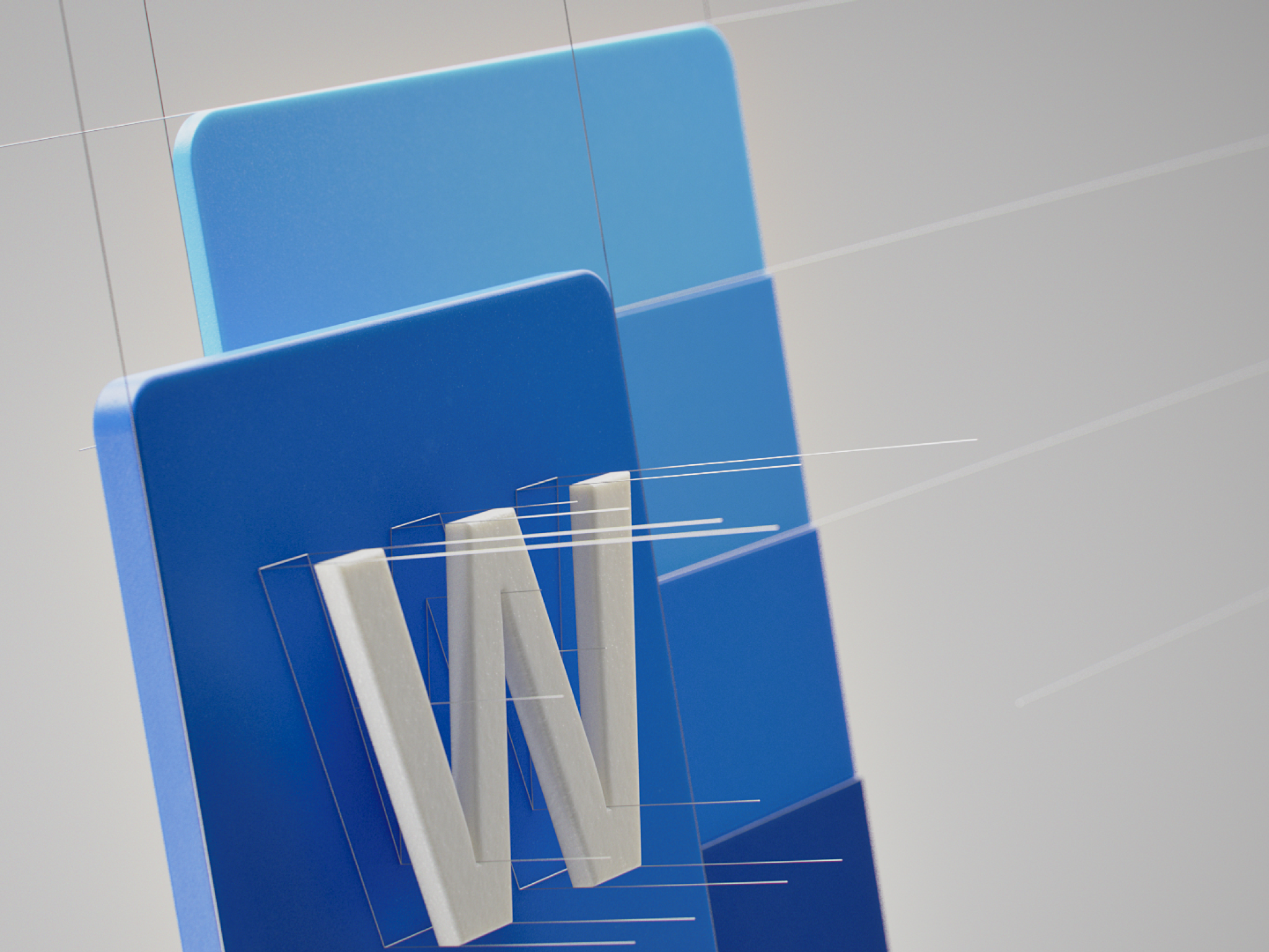
M365 App Icons
I was asked to be part of a small internal v-team tasked with leading a redesign of Microsoft’s “core ten” app icons, with the understanding that the approach would eventually be scaled and applied to other Microsoft apps. The team was asked to move away from the “perspective” icon aesthetic and I helped push the foundational thinking towards a simple, iconic, modular icon design direction.